


As a guy who’s been waiting a long time for the Pixel Fold, you can pretty much trust that I want to see everything about this phone with rose-tinted glasses. I want it to be better at tasks than other phones. I want it to be more fun to use and I want it to be so good that going back to a boring old slab phone feels, well: boring.
And in a handful of scenarios, I get that exact sensation. Using messaging apps like Gmail or WhatsApp in a two-pane setup feels amazing and apps like Google Keep are definitely a better experience than what I get on any standard smartphone . But for every one of those types of experiences, I have at least 20 less-than-great interactions with web-based content, and that’s where things get pretty crappy, pretty fast.
The mobile web wasn’t built for it
As a former (also current, I guess) front-end web developer, I’ve built my fair share of websites. And with those hundreds of builds, I put a lot of thought into every element included on the site and how they would work well together on smaller screens.
The general workflow basically went like this: see what each element would do when resized, make sure the phone version was tight and thought out, and then do some basic cleanup for each size in between.
The majority of flexible website layouts in recent years have focused mainly on two main sizes: desktop and mobile. After all, the number of people viewing any given site on a tablet-sized screen is minuscule compared to the number doing the same via a proper laptop/desktop and/or phone. So, basically, as long as the tablet views aren’t broken and the landscape orientation for larger tablets shows the desktop layout, things are pretty good.
Please enable JavaScript
But now we have what I like to consider an in-between size that needs attention. At least, it eventually. Foldables clearly represent a fraction of one percent of web browsing traffic, but as they grow in popularity, web developers will need to keep in mind what’s going on. Because right now, it’s not good.
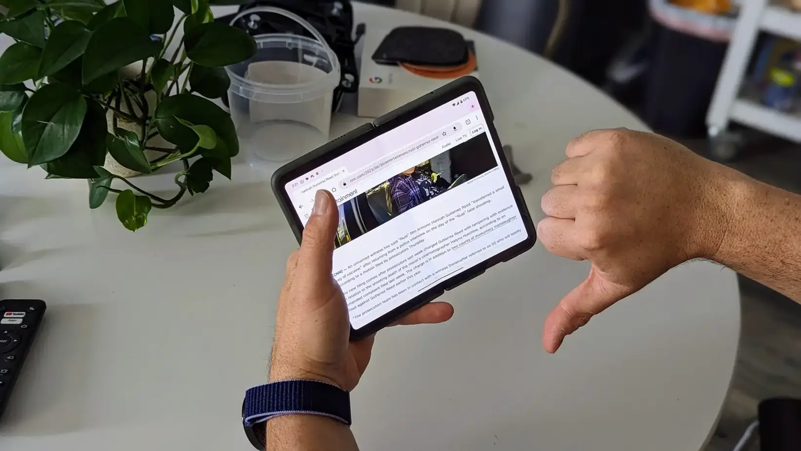
Most websites (including ours until I pushed updates today that you may or may not have seen) don’t have rules in place for the screens these folding phones have. Inside the Pixel Fold, for example, you have a screen that’s not too big to be a large tablet and not small enough to format things on the page in an aesthetically pleasing way like a standard smartphone. See an example of this below, which shows a full-width site and then the same site is returned to a more standard smartphone container via the Pixel Fold’s split-screen:
First, I’m not taking any shots at Tom’s Guide; I could have used any number of sites big or small that weren’t just set up to take advantage of or look good on a screen too big to be a phone and too small to be a tablet. For most of them, the padding to the left and right of the content is simply minimal to make things more readable on a thin and narrow smartphone screen. And when you take the same approach and lay out the content on a wider display, things look strange.
Again, none of this is anyone’s fault, but Reading web content with this phone’s larger screen feels like reading a magazine without the columns and sentences running from one side of the page to the other side of the adjacent page. Nobody wants that and it makes sense when you think about the newspapers and magazines that have been showing themselves in the columns for all these years. For whatever reason, it’s easier to read and consume that way.
And for someone like me who spends a lot of time on my mobile device reading articles and consuming content, I’m a bit confused by this right now. Being completely blunt, I don’t like reading Pixel Fold articles at the moment. And while I think mobile app developers will slowly but surely adjust their phone-only apps to make sense on tablets and folding phones, I’m just not sure how many web developers very concerned with building a good UI for this screen size. .
And that makes me sad because there isn’t much Google or any other phone maker can do to fix this issue. Over time, I think the web will adapt if enough people have bigger screens in their pockets. The mobile web took years to arrive, but eventually everyone is on board. If there are enough foldables, web developers won’t be able to ignore the form factor.
But until that is the case, it certainly makes using one of these phones seem like a chore. While you’d think a wide mobile screen would just make everything better, in this case it just isn’t and I almost prefer to just use the smaller, external screen for reading content. That sounds crazy, right?
My main frustration comes from not being sure what to do about it now. I guess if I can find enough beauty in everything else to top the Pixel Fold, I can find peace in all the awkward web content. But I’ll be honest, it’s going to take a lot of charm to make up for this difficult part of the experience for the foreseeable future. As time goes on, I think that may change. I just don’t know that I’m willing to wait until it happens.
Related
#main #disappointment #Pixel #Fold #web


Add Comment